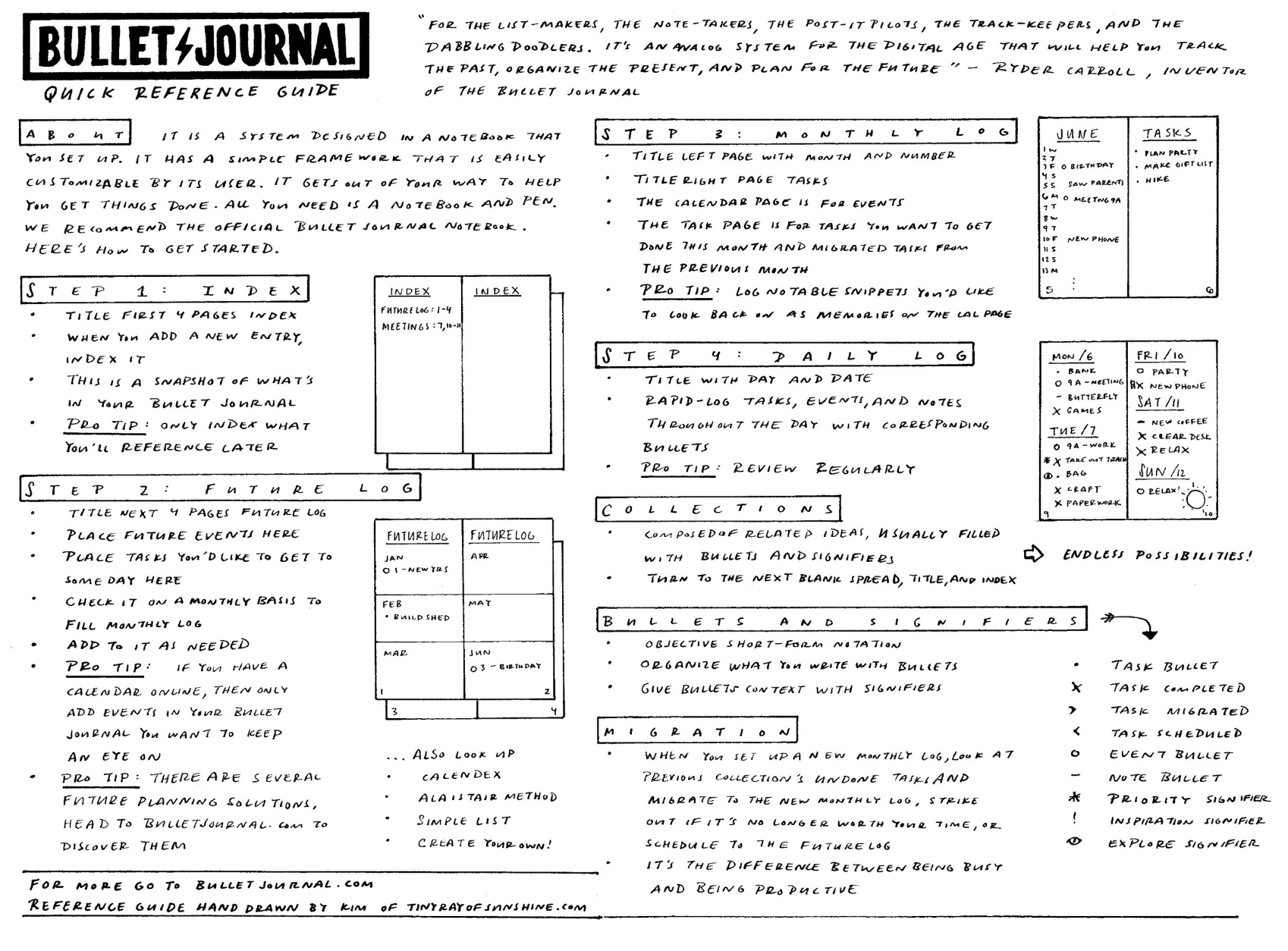

Layout Idea: Weekly layouts
/Hello there,
I have been meditating on all sorts of layouts for this particular post. I'm excited to share with you the labor of love that I've come up with.

If you prefer to just use weekly layouts, then this post will be your jam! If you're considering adding weekly layouts or wondering how the weekly view is useful, then this post will also provide you with a lot of weekly layouts and some examples of how they can be used.
If you are finding that you want to "zoom" a bit more into your schedule than the monthly view lets you and daily does not allow you to visualize what you have going on for the week, then the weekly overview is probably something you will want to consider incorporating. You can use the weekly layouts just by themselves or as an overview of your upcoming week. You may find they supplement to your daily pages quite nicely, keep an eye out for the next post that will cover more on weekly + daily layouts.
I recommend picking whichever layout catches your eye. Find one that you think would work for you and try that one out. You could also just try out a new layout each week until you find the right fit for you :)
I tend to tweak them a little each time I use one. Let's dive in!
Let's go over quickly some key things to know about the weekly view.
Benefits of a weekly overview:
- You have the whole week at a glance.
- You don't have to redraw a new page each day.
- You can quickly glance at what you need to do each day and dive right in.
- You will only see a week at a time, which for many is the amount of days they need to keep an eye on.
- You can see all the tasks you got done over the week.
- You can prepare yourself for the following day's activities.
- If you find that you like this view, you can set up a few weeks ahead of time.
Drawbacks of a weekly overview:
- You won't have as much room each day to write in.
- You will only be seeing a week at a time.
You should use week view if:
- You like week view.
- You like knowing what's going over the week.
- You like taking things one week at a time.
- You like to plan out weeks one by one.
- You don't generally need to add too many notes on a daily basis throughout the week.
- You need a good idea of what is happening throughout the week.
- You like to get working right away each day without having to set up any daily pages.
- You like having an overview of what's going on over the week.
- Thinking in a weekly basis clicks with you.
- You like to have a lot more room for detail than the month view affords you.
- You find that you don't check your daily page throughout the day and would rather word in a weekly view.
- You get discouraged about not getting things done, having a weekly view will remind you of what you have done during week.
- Your work/school/social life requires you to work in a week view.
Weekly only
There are several kinds of weekly layouts that you will come across, here are some of them:
Traditional weekly layouts
have squares where you have only a small amount of room to write tasks, events and notes. These are the most commonly found in regular planners.
Time-based
layouts are weekly layouts that have an emphasis on keeping track of time, so that you can visually see how your days are spread out. These are useful to help you figure out when you have time get things done.
Lastly, there are free-form layouts. These are awesome and custom. There are more ideas for these than I've included ideas for and these lend themselves quite well to the Bullet Journal lifestyle.
Now, without further adieu, let's get a'lookin'! Keep in mind that these will all be in Monday start. I used to do Sunday start, but it just makes more sense to me for the weekend to be visually set off at the end of the week.
Common and traditional

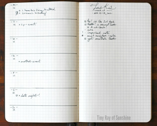
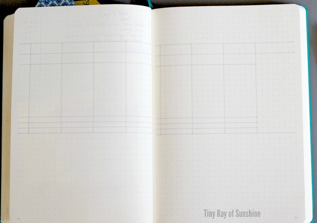
1. This is the layout you are probably most familiar with. It has 6 even spaces and one half-sized section for Saturday and Sunday.

2. This is the same layout as before, with minor aesthetic differences.

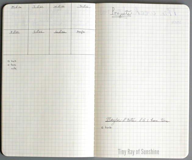
3. This layout has 8 evenly spaced boxed with the last box open for notes, weekly goals, etc.

4. This is similar to the last one, but has a tracker instead of an open box for notes.

5. Here is a week on the side with a whole page for notes for that week. Some ideas for this layout that come to mind: use the left side for appointments, events, deadlines; the right side for goals, tasks that must get done, tasks you'd like to get done, routines, steps for projects and any notes you may have.
6. Here is an example of how this spread could be filled out.

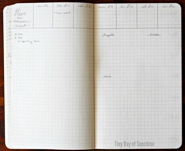
7. This spread is similar to the two above it, but the left-hand side has been divided into three separate sections: morning, day and evening. If you find that you have a few tasks that you need to get done at different times of the day, then you may find this helpful. Again, it has a lot of room for notes on the right-hand side.

8. Similar to the spread above, except the left-hand side is divided into the following three sections: events, dinner and focus. Here you have space for your appointments and events, what you're going to have for dinner, room for prep steps, and focus. The focus section could be your top 3-5 tasks that you will focus on each day. They are off-set in a way to be easy to find each day. Again, room on the right-hand side for any sort of set-up you can think of.

9. This spread is similar to the above, except instead of being small rectangles, the left-hand side is divided into small squares. The right-hand side has room for notes, tasks, etc. The banners add a little touch of personality.

10. If you prefer more of a vertical view and think in lists, then this spread might work out because each day is the size of a small to-do list. It is divided into eight even spaces, one of which could be dubbed, "next week, doodles, weekly" or whatever else you come up with.

11. Here is a variation of the above spread. If you find that you have quite a few tasks to account for Monday through Thursday (if you're in college, for example), but not many on the weekend, then this spread could work. It also has room on the side for notes, tasks, doodles, etc.

12. If you need a lot of room for notes and want only a weekly view that compartmentalizes your days into the different sections of your life, then this spread could prove useful. The dates are along the side and the main sections could be, events, school, work, and all else.

13. If you like this spread, but find that you have more sections of your life to keep in mind, just add more columns! For example, this spread has sections for, events, work, home, grad thesis, class #1, class #2, and internship. These layouts are well-suited for students, parents, etc.
(Note: Some of you may be chuckling at the notion of the grad thesis section, maybe thinking "That's not enough room!" I'm not sure, I haven't been to grad school. But, from what I've heard, they generally have specific tasks and then have to spend a lot of time on those, such as researching a specific item. If this is so, then I think keeping the list small, but manageable and meaningful each day will help grad students feel less overwhelmed and more productive each day.)

14. Here is a student-specific spread with rows for the dates and columns for classes. I used this spread to help me keep track of class related events and activities. In the image you will see examples of different ways of writing down steps to complete assignments. The squiggly brackets mean due date. This way you can break down the small steps you can do each day to finish up parts of the assignment and have the due date in view. This also helps for projects and knowing when deadlines are.

15. Here is the same layout with the dates along the top as columns and sections of life as rows.

16. If you like the idea of having tasks divided up by times of the day, such as morning, day and night and like vertical spaces to write down tasks each day, then this spread may be right up your alley. The spread is divided into eight even spaces. The one at the far right I divided into three sections as an example to include a small view of the month, a quote, and a section for maybe tasks. Maybe tasks are those tasks that you haven't assigned a day to, and if you have time, you'll maybe get around to.
For example, skydiving. Don't need to do it this week (or ever), but maybe. (Just as an extreme example hehe).

17. Now we're getting into more creative layouts. On the left-hand side of this spread, you'll see three sections: events, tasks and notes. The right-hand side has room for Maybe's, a tracker (for routines/habits/etc.), and doodles. This is a sample of idea of how you can design your weekly spread to suit your unique personality.

18. This spread has a great combination of structure and free space. On the left-hand side you could have events and appointments across the top with a lot of room for tasks on the bottom. On the right-hand page you could have a tracker along the top, with plenty of space for notes.
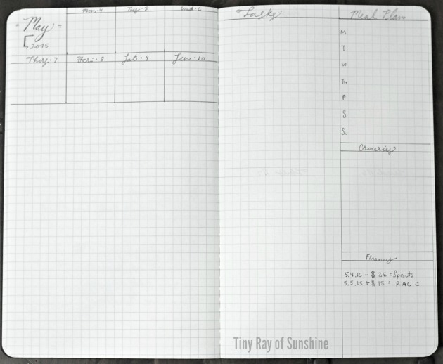
19. This spread has room for appointments and events along the top with room for notes on the bottom of the left-hand page. The right-hand page has sections for tasks, meal planning, groceries, and finances.
20. If you like this kind of layout, but need less specific sections and more room for notes, this spread is the peanut to your butter. The left-hand side has room for events, appointments, tasks, notes, etc. The right-hand side is divided into two sections: project steps and maybe/notes/if I have time.
21. If you like the idea of the small boxes, but want them spread out across the top of the two pages, then here is such a spread. The bottom section has space for tasks, projects, errands, work or any other sections you may fancy.
22. If you like the idea of those boxes, but want them stretched out so you can write more in them, yet want to keep free space along the bottom to write out anything your heart fancies, then so be it. Here is a spread for you.
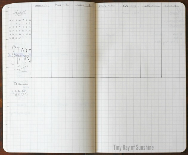
Note:You may have noticed my love for tiny calendars. I love those little guys, they're cute and you can circle the current week. Also quotes. Necessary for those moments of dubiousness. Dubious, a fancy word that simply means you're in a state of doubting yourself. I have too many of those.

23. Here is a spread that combines many of the elements of the above spreads. The top has days with plenty of vertical space. The bottom left-hand side has room for tasks and projects, the bottom right-hand side has room for notes and a tracker.
Time slots
There are other layouts that have a heavier emphasis on time slots. These are particularly helpful if you have a lot of events going on that you need to keep on top of. They are also great for when you just do not have the time to recreate a new layout each day and want to get going as soon as possible.
These types of layouts are great for anyone who has a lot of appointment or events, such as working professionals, parents, students, etc. This is also a good layout if you find that you need to manage your time better.
Slotting events by time will help you gain more control of your day as you will have a general idea of what you should be doing at any given time. If you decide to go this route, you might find that you are scheduling every moment of your day. At first blush that may seem like a good idea, and it's worth experimenting with, but from experience I have found myself more stressed out planning every moment.
I tend to use this page to see when I have certain events that are non-negotiable (that I have committed to beforehand, such as work, etc.) as well as blocking out time to write, etc. It's best not to over-schedule yourself or you'll find yourself burnt out and distressed.

24. Here is one of my favorite examples of a timeline. This has a lot of room for notes and tasks along the bottom and the top section is for placing events and appointments in a time-based manner. You can alter this according to when you start your date and end it.

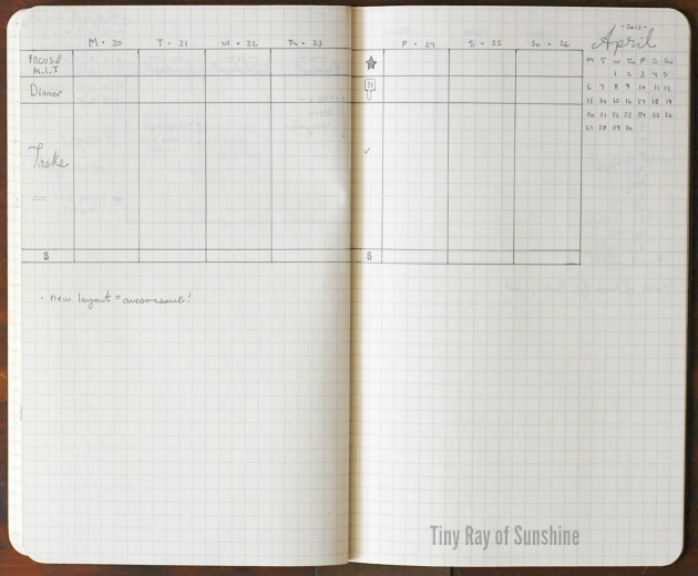
25. Here is a variation of the above spread. I love this. I came up with this some time ago and have been using a variation of it for the last month and a half. The beauty here is the power of the rows. Place what you'd like to track, here I placed focus/m.i.t.(most important task), dinner, time slots, and finances.
The way this works is that you have a bit of room to write in the number one thing you must get done for the day; you have space to see what's for dinner for the night; you can see what you have going on for the day; you can track how much money you spent/earned/etc. Then, along the bottom you have a bunch of room for notes and tasks.
I find this to be my favorite kind of weekly layout. And of course the mini calendar and quote make an appearance.
Free Form
Many of the above layouts that were under "common and traditional" also count as free form.
26. This layout is a similar take on the previous layout, with one main difference: instead of having a time slot area, there's room for tasks. This is handy if you're shooting to get specific tasks done on certain days. Along the bottom you could doodle or put highlights of your week and other awesome noteworthy things that happened. If you noticed, there is also a pictorial variation of the rows on the right-hand page.

27. Here are more columns. I used this specific spread for a week and created variations off of it. I like it a lot. It has sensible space and creates limits for me to not write down more than I can handle each day.
The way this spread works is by placing the rows in the order that I like to take in my day. The sections are as follows: clean, events, dinner, blog post, admin, projects, to do, done, Instagram photo challenge, finances, and highlights. Here's how it works in my medium dotted Leuchtturm 1917:
- Clean: (1 space) I write in that I did my daily cleaning for the day
- Events: (3 spaces) I write down whatever events I have going on for the day
- Dinner: (2 spaces) Write down the meals planned for the week with a prep step
- Blog post: (2 spaces) Blog post to work on
- Admin: (3 spaces) Get 3 things done here
- Projects: (5 spaces) I usually have several projects going on at one time, this ensures I get the next step done for each.
- To do: (8 spaces) 7-8 miscellaneous things that I need to get done.
- Done: (5 spaces) I have this section because I usually tend to get things done that weren't on my original list and want to jot down that I did them.
- Instagram challenge: (2 spaces) Here I write down the prompt for the day. I like Instagram and I like taking photos. This section helps me stay on top of challenges. Two spaces if I'm doing two challenges, one space if I'm only doing one
- Highlights: (4 spaces) This is a happy spot to write down wonderful things that happened. Sometimes we can be bogged down by the mundane of everyday, so it's nice to write down and look back on the awesome moments of the day.

28. Here is a much more freeform layout. It has four main sections: events, tasks, tracker, and notes. The stripped essentials.

29. Another idea is to take the concept of sections of your life, and make a weekly spread based off of those, thus grouping all events, tasks and notes for those areas together. For example, here we have the following sections: events, work, home, school, garden, and highlights.

30. Here is another spread that is stripped down to bare bones essentials: events, tasks, maybe and an entire page for notes or tasks, etc.

31. Back to the concept of grouping sections: events, work, personal projects and tasks, notes and doodles, habits, meal plan. To snazzy up your meal plan, you can come up with meal ideas for the separate meals in your everyday.

32. This idea I got from another blogger (can't link to her because her site disappeared). I love it. The idea behind it is that you create a spread, divided into four. Each box represents an entire week. This way you can just write down everything you'd like to get done for the week in here. The best part about it is that if you set up a year's worth of weeks ahead of time, you can effectively future plan on a weekly basis. I set up a separate Bullet Journal similar to the way she did because it's so awesome. (:
How I create weekly layouts and how to design your own
I use a dot grid Leuchtturm 1917 notebook. If you still haven't picked out a notebook, here is a blog post I wrote on popular notebook options for the Bullet Journal.
I like to count the squares available and think about how I am going to create the layout from there. For example, the medium Leuchtturm 1917 dot grid has 38 squares vertically and 26 horizontally (per page). Let's take this recent weekly layout that I designed and tested out.
Here I started 6 rows down. I decided to have 7 columns divided to be 6 squares wide.

Next, I add some key symbols and words on the sides to make the rows have meaning. For example, in this spread I tried out the rows: blog post (to indicate what blog post I would work on for the day), dinner (symbolized by a cute little apron), time, clean, instagram photo challenge photo prompt (symbolized by a little camera), and finances (dollar sign). The finances section can be a spot for how much I spent/earned each day.

Lastly, I added some words in black to make that area stand out more. And, since my objective is to show you how my process actually tends to be, there does tend to be a bit of white-out sometimes, as demonstrated on this page. Surprisingly, even though the Leuchtturm is a nice cream color, and white-out is, well, white, it blends in well with the page.
I love that Amy Poehler quote, "You do it because the doing of it is the thing. The talking and worrying and thinking is not the thing" I need to abide by it more often.
Phew! Hope that this blog post has been helpful in giving you ideas with how to set up a weekly layout! Please let me know if you are going to try out any of the layout ideas in the comments. Do you do a weekly layout already? What do you include in yours?
Be sure to check out my Instagram as I tend to post photos of spontaneous layouts and ideas that I come up with. I will do my best to update this post with more weekly layouts, so be sure to check back periodically if you found these helpful.
Please share this with others that you think will find these layouts useful.
If you take inspiration from these layouts and post your variation online, please mention this post so that others can be inspired as well, thank you!
Notebooks used:
- Leuchtturm1917 (dot grid)
Please do not use any of the more creative designs in any commercial work. These designs are meant to be shared among fellow Bullet Journal users and shared with the idea that these will be drawn into journals. I might make these into printables someday if there is interest. Thank you.
This post contains affiliate links which means that if you click on a link and purchase an item through Amazon, I will make a small commission at NO extra cost to you. Thank you for helping support Tiny Ray of Sunshine!